
Photo by Author
Updated: In my article at Smashing Magazine, I go into more detail about the approach, as well as live code examples that you can play with on CodePen.
I already wrote about the UI Kit, its development environment and integration with designer tools. But let’s talk a little about colors. This is very associated with my current and past tasks on projects, and I want to share my vision of the approach to organizing and configuring the color scheme of the UI Kit and the entire web application in this part as a whole. Why we should bother and complicate this part? Below are a few reasons why this may be necessary.
Rebranding (Brand Refresh) is the process of changing the appearance of an application, from the logo and color scheme to typography and visual presentation of certain UI components. No one of the products is static in terms of its own style or brand, always with some periodicity, the style is refreshed — globally or not.
Theming is the functionality of applications that allow you to change color schemes. This can be an interesting opportunity for the end-user to customize the system for himself, or it can be a part of your strategy for localizing and adapting the system to a specific target market.
White Label is a mechanism that allows you to configure the appearance of certain components (brand them) for the end-user. These can be mailing templates, electronic documents, custom forms, etc.
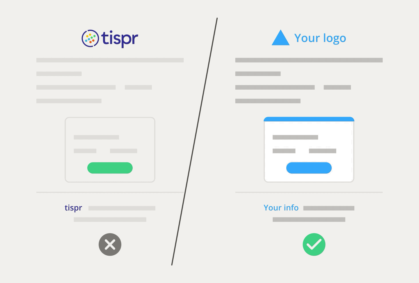
Tispr White Label feature
The Dark Mode — along with the release of macOS Mojave, developers from Apple implemented a new built-in feature in Safari and now we can adapt websites to the dark mode of the operating system. Soon users will expect two modes from each web application or website by default. This will be a part of our normal life.
All of the above, these are typical tasks, there are many smaller and more specific cases where a well-organized color scheme can help in the development and customization of the user interface.
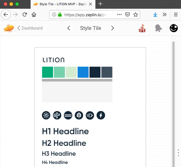
Color scheme of my previous project (Lition, design from Zeplin)
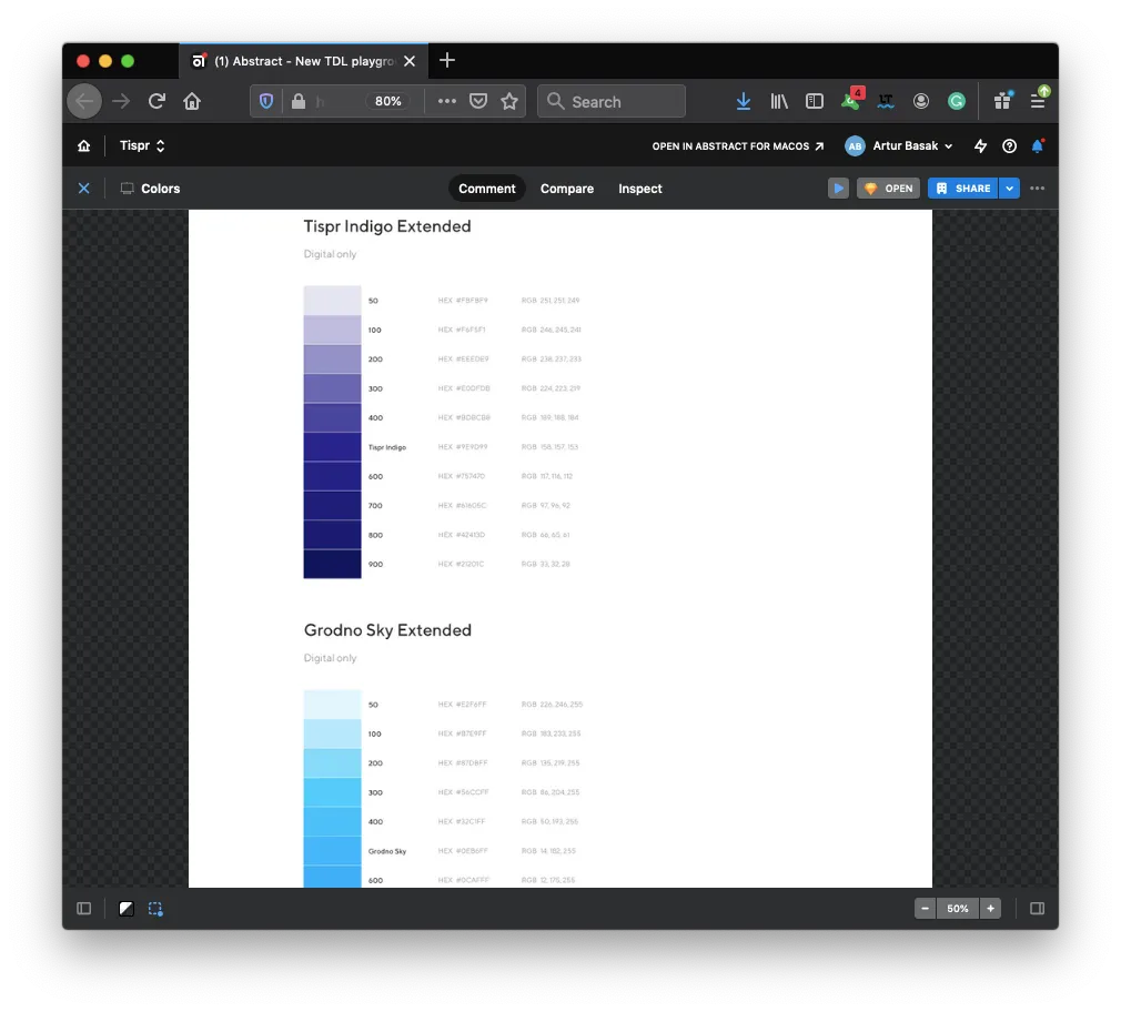
Color scheme of my current project (Tispr, design from Abstract)
Color Tools
For a long time, preprocessors have been the main tool for configuring the color scheme in a web application. Variables are the main mechanism for setting up and organizing colors in project styles.
Such tools are extremely rich in functionality. Take the same SCSS/SASS, it has an incredible number of functions for working with color — these are variables, and the functions adjust-color, mix, change-color, scale-color and obsolete are already darken/lighten, while all functions support different color formats and implemented in C ++.
The non-universality of these tools lies in the fact that they are used mainly only at the stage of project assembly, i.e. while the web application is running, none of the preprocessor functions can be used, because the browser does not understand this language.
The best that can be done is to generate preprocessor code on the fly and compile it in CSS either on the frontend or the server side. Nevertheless, both approaches will be very slow in performance compared to any native options.
Currently, in all modern browsers, a powerful native mechanism of variables has appeared — CSS Variables / Custom Properties. The two main advantages of native variables over preprocessor variables are full support for the cascading style model in the browser and the ability to change them on the fly in a running application from CSS, HTML (inline styles) or JavaScript.
The combination of these two tools — preprocessor functions and native CSS variables — is what I would suggest using for setting up and configuring the color scheme for any web application or website.
Hint: CSS variables are not supported by the good old Internet Explorer. In the foreseeable future, this is not a problem, however, here and now you can try to look in the direction of the corresponding polyfills like ie11CustomProperties.
Color Palette
The first level of configuring the colors of any web application or site is the palette. The whole palette should be built on just a couple of basic colors. According to color theory, there are only a few schemes for creating a color palette:
- Monochromatic scheme (one primary color)
- Complementary scheme (two primary colors)
- Triad scheme (three primary colors)
- Tetradic scheme (four primary colors)
- Adjacent pattern (two or three primary colors)
More complex schemes have a place to be, but most likely they will be too redundant.
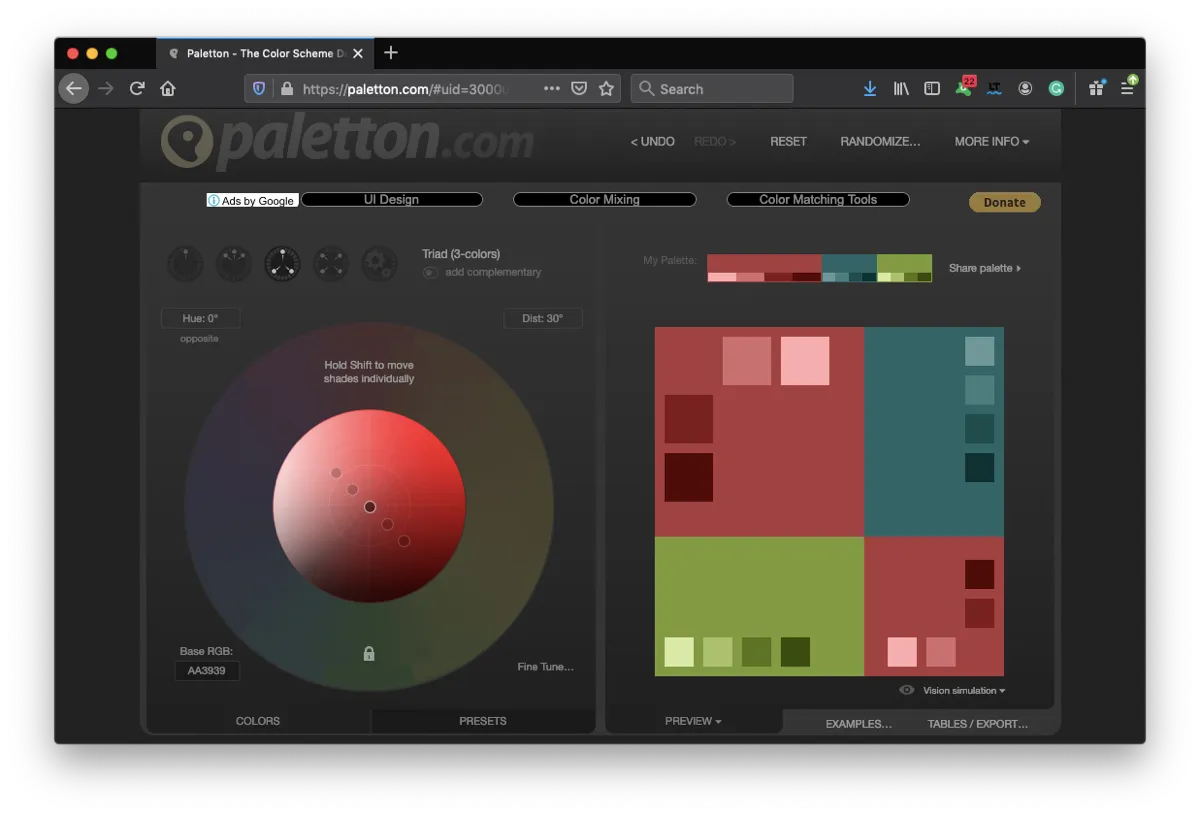
Hint: To create a list of primary colors, according to a certain scheme, you can use special online services. For example, I used the Paletton service to select the colors for my own website. There are also services that generate more intricate names for the primary colors; on several projects, I used the Name-That-Color service.
/* Color Palette: Triadic Scheme */

:root {
  --medium-carmine: #aa3939;
  --blue-dianne: #226666;
  --sushi: #7a9f35;
}
In addition to the primary colors, as a rule, several secondary colors are added to the palette. Usually, these are tones and mid-tones of the primary colors (for example, for various states of controls — focused, hover, disabled), as well as white color, plus shades of black and gray (for application background, text color, section borders, frames, shadows, etc.).
Tones and mid-tones are always derived from the primary colors, it is extremely tedious to enter them by hand, so it is much easier to get them by calculation. For example, in SCSS, this might look like this:
/* Color Palette: Triadic Scheme */

$sushi: #7a9f35;
$blue-dianne: #226666;
$medium-carmine: #aa3939;

:root {
  --sushi: #{$sushi};
  --sushi-10: #{scale-color($sushi, $lightness: 10%)};
  --sushi-20: #{scale-color($sushi, $lightness: 20%)};
  --sushi-30: #{scale-color($sushi, $lightness: 30%)};
  --sushi-40: #{scale-color($sushi, $lightness: 40%)};
  --sushi-50: #{scale-color($sushi, $lightness: 50%)};
}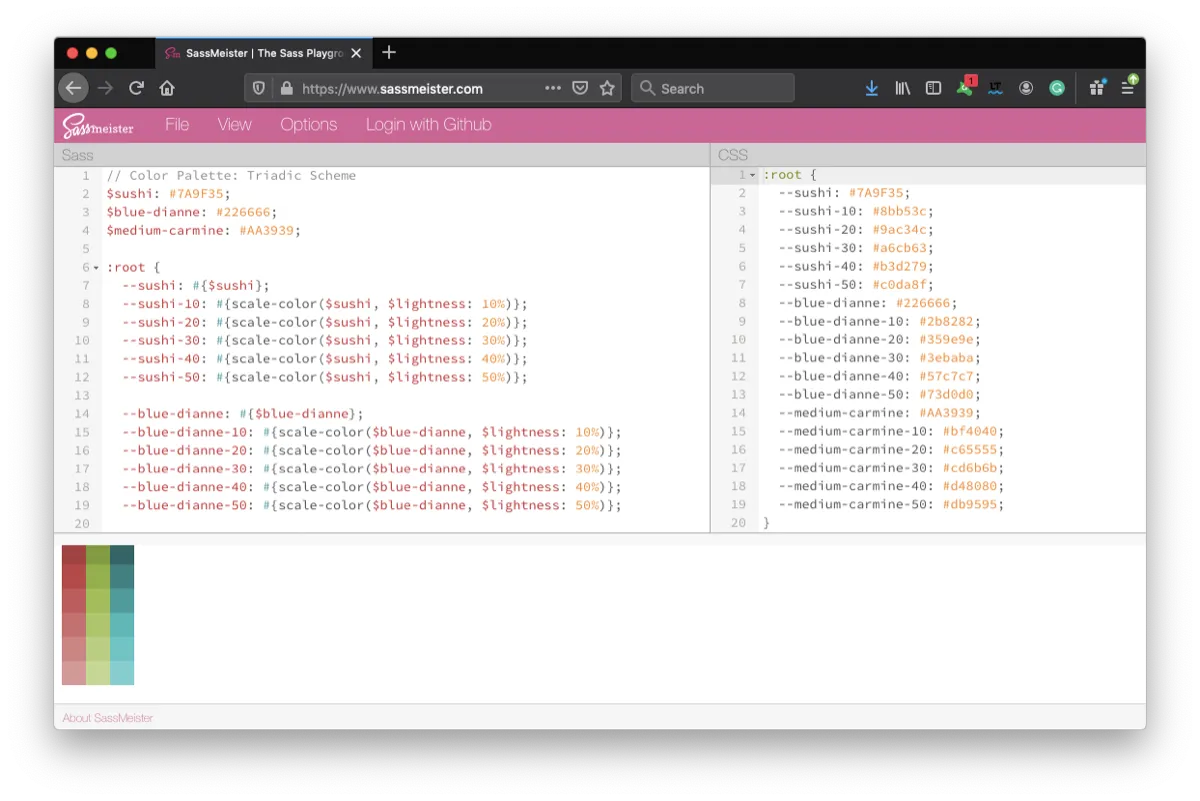
For sure it’s just an example and palette creation by configuring lightness is only one in many ways. You can mix black and white colors to primary or play with saturation. You should communicate with design team and choose optimal algorithm for that.
It is unlikely that the palette will need to be changed in a running application, changing the palette is either a rebranding of the entire application or a slight modification of the primary colors, say, to correct the contrast for compliance with WCAG specification accessibility requirements. But replacing the palette — changing the color theme of the application — this is a frequent task for application runtime.
Hint: WCAG 2.0 level AA requires a contrast ratio of at least 4.5:1 for normal text and 3:1 for large text. WCAG 2.1 requires a contrast ratio of at least 3:1 for graphics and user interface components (such as form input borders). WCAG Level AAA requires a contrast ratio of at least 7:1 for normal text and 4.5:1 for large text. You can check the contrast of colors using online services (for example, WebAIM Contrast Checker or Contrast-Ratio from Lea Verou).
But If there is a need to change the palette in a running application and recalculate all tones and mid-tones on the fly, then it makes sense to turn your attention to the hsl color format and the native CSS calc function.
:root {
  --sushi-h: 81;
  --sushi-s: 50%;
  --sushi-l: 42%;
  --sushi: hsl(var(--sushi-h), var(--sushi-s), var(--sushi-l));
  --sushi-10: hsl(var(--sushi-h), var(--sushi-s), calc(var(--sushi-l) + 5%));
  --sushi-20: hsl(var(--sushi-h), var(--sushi-s), calc(var(--sushi-l) + 10%));
  --sushi-30: hsl(var(--sushi-h), var(--sushi-s), calc(var(--sushi-l) + 15%));
  --sushi-40: hsl(var(--sushi-h), var(--sushi-s), calc(var(--sushi-l) + 20%));
  --sushi-50: hsl(var(--sushi-h), var(--sushi-s), calc(var(--sushi-l) + 25%));
}
In my opinion, the trouble with the HSL format is that only few people work with it, like front-end engineers or designers who code. After all, it is very important that both UX, designers and server programmers use the same format in this regard. It will be extremely inconvenient to study colors on design mockups in HEX and then translate them into HSL. In turn, it will be inconvenient for testers to verify the colors in the application and match them with the colors in the designs. In general, according to my feelings and from my experience, at the level of team interaction, the industry is not yet ready for this format.
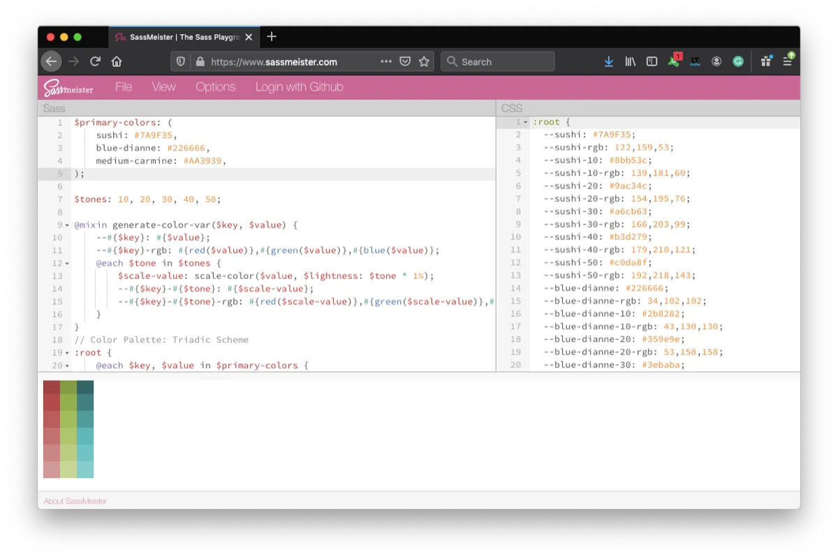
Preprocessors are equipped with the capabilities of full-fledged programming languages, it is possible to use conditional operators, functions, and loops. Thus, everything can be written very concisely without boilerplate code:
$primary-colors: (
  sushi: #7a9f35,
  blue-dianne: #226666,
  medium-carmine: #aa3939,
);

$tones: 10, 20, 30, 40, 50;

@mixin generate-color-var($key, $value) {
  --#{$key}: #{$value};
  --#{$key}-rgb: #{red($value)}, #{green($value)}, #{blue($value)};
  @each $tone in $tones {
    $scale-value: scale-color($value, $lightness: $tone * 1%);
    --#{$key}-#{$tone}: #{$scale-value};
    --#{$key}-#{$tone}-rgb: #{red($scale-value)}, #{green($scale-value)}, #{blue($scale-value)};
  }
}
/* Color Palette: Triadic Scheme */

:root {
  @each $key, $value in $primary-colors {
    @include generate-color-var($key, $value);
  }
}
The function also adds a color option in rgb format, so that later it will be possible to use the alpha channel in rgba format.
Brand Colors or Theme [Global Scope]
The next level of application color configuration is its theme, corporate colors, or brand. In fact, these are variables that do not carry information about particular color value, it will be red or blue, and it is also not clear from the name of the variable in which component it will be used, which control can be configured by it.
At this level, we form a common understanding of what colors our application consists of. For example, in the primary color, we color the header of our application, buttons with a positive context, such as “OK” or “Yes”, and headings of the second level.
The secondary color is used for buttons with a negative context, such as “Cancel” or “No”. Tertiary for auxiliary action buttons and some blocks of advertising sections.
At the same time, we also have the color of the main text, for paragraphs, color for text hints, text which describe validation errors, and color for alerts.
:root {
  /* Brand Colors / Main Theme */

  --primary-color: var(--sushi);
  --primary-active-color: var(--sushi-30);
  --primary-disabled-color: var(--sushi-50);
  --secondary-color: var(--medium-carmine);
  --secondary-active-color: var(--medium-carmine-30);
  --secondary-disabled-color: var(--medium-carmine-50);
  --tertiary-color: var(--blue-dianne);
  --tertiary-active-color: var(--blue-dianne-30);
  --tertiary-disabled-color: var(--blue-dianne-50);
  --primary-text-color: var(--black);
  --secondary-text-color: var(--black-10);
  --error-text-color: var(--red-50);
  --alert-bg-color: rgba(var(--medium-carmine-rgb), 0.6);
  --control-border: 2px solid var(--gray-20);
}
All these are colors describing the theme of our application, none of them carries information about what kind of color value we use, but only in what context we use this or that color. Having such separation of the palette (specific color values) from the theme (contextual colors), we can easily configure the latter, for example, for the dark mode.
@media screen and (prefers-color-scheme: dark) {
  :root {
    /* Dark Mode / Theme */
    --primary-color: var(--sushi-20);
    --primary-active-color: var(--sushi-30);
    --primary-disabled-color: var(--sushi);
    --text-bg-color: var(--black);
    --primary-text-color: var(--gray-light-40);
    --secondary-text-color: var(--gray-light-10);
    --error-text-color: var(--red-50);
  }
}
We can easily redefine corporate colors, replace one palette with another right on the fly. If the colors come from the server, i.e. since we enable the user or marketers with designers to configure the theme, we can redefine the variables both in the middle of the cascade and at the root level of the entire application directly from the JavaScript code using inline styles or the CSSOM setProperty function.
document.documentElement.style.setProperty('--primary-text-color', textColorFromServer);And vice versa, directly in JavaScript code, we can get the value of any CSS variable thanks to the CSSOM getPropertyValue function.
Hint: Use the -color postfix for color variable names and -bg-color for background color variable names. This will help visually distinguish between color variables among themselves and distinguish them from the values of other attributes. Use a special prefix for all variables of your application, this will avoid unforeseen overrides and intersections with variables from styles of third-party libraries.
:root {
  /* Brand Colors / Main Theme */

  --myapp-primary-color: var(--myapp-sushi);
  --myapp-primary-active-color: var(--myapp-sushi-30);
  --myapp-primary-disabled-color: var(--myapp-sushi-50);
  --myapp-primary-text-color: var(--myapp-black);
  --myapp-text-bg-color: white;
}
Component Colors [Local Scope]
The last level of color scheme configuration is the level of the UI components or just local scope. This approach will allow you to redefine the upper-level setting (theme colors) in some special cases when the UI element should have a color that is not part of the design system or control has several states with different colors for each. A good example of such a need would be the white label functionality in the target web application.
.button {
  --btn-color: var(--black);
  --btn-bg-color: var(--gray-5);
  --btn-shadow-color: var(--black);
  --btn-border-color: var(--gray-10);

  appearance: none;
  font-size: 1rem;
  line-height: 1.5;
  font-weight: normal;
  width: 20em;
  border: 2px solid var(--btn-border-color);
  padding: 0.5em;

  color: var(--btn-color);
  background: var(--btn-bg-color);
  box-shadow: 0.2em 0.3em 0.8em var(--btn-shadow-color);
}
.button.primary,
.button.secondary {
  --btn-color: white;
}
.button.primary {
  --btn-bg-color: var(--primary-color);
}
.button.secondary {
  --btn-bg-color: var(--secondary-color);
}
If before, in order to recolor control, we needed to hang an additional CSS class and describe a couple of properties, now we can do this simply by redefining the variables, and for this, we do not always need an additional class, we can do this simply in the inline styles or just in program code.
buttonElement.style.setProperty('--btn-bg-color', whiteLabelBgColor);Returning to the topic of tones and mid-tones, as well as their calculations on the fly. Such features may well be needed at the component level. In this case, I would still suggest looking at some CSS tricks and properties that allow you to get tonality without implementing the corresponding functions on the JavaScript side. For example, linear-gradient, filter: brightness(?) and blend-mode can help with this:
:root {
  --primary-color: var(--sushi);
  --primary-active-color: var(--sushi-10);
}
.button.primary {
  --btn-bg-color: var(--primary-color);
}
.button.primary:hover {
  --btn-bg-color: var(--primary-active-color);
}
/* CSS-trick, color will be the same as --primary-active-color */
.button:hover {
  filter: brightness(1.125);
}
The minus of the approach with filter is that we change the brightness of not only the background of the button but also its text, i.e. for all descendants in the DOM, the filter will also apply. If there is a need to color only the background, then the combination of the background-color and background-image properties together with the linear-gradient value will do better.
In fact, the consortium and CSS Working Groups have long been trying to implement native color modification features. The color-mod function was proposed in the CSS Color Module 4 Working Draft; the last CSS Color Module 5 draft contains a description of the color-mix, color-contrast, and color-adjust functions. Well, I hope the implementation of such functionality in browsers is just around the corner …
Hint: You should not produce too many color variables at the component level. In many cases, color can be reused or inherited by correctly applying the values inherit/unset/revert and currentColor, as well as taking into account the features of the cascading model.
Performance
Probably any experienced developer will ask, but what about the performance of CSS variables? First, you need to understand that color change triggers only the repaint/redraw process, and as we know, this process does less performance damage than the reflow/layout process. Therefore, the variables responsible for the color and their change will be less likely to hit the rendering speed of your UI than the change of variables associated with any size, positioning, or animation.
Secondly, the higher the variable in the cascade, the greater its influence on the DOM tree, respectively, when changing such a variable, more checks are performed than when changing a variable from the scope of a specific component.
Hence, the conclusion is that it is better to distribute the most frequently changed colors among the local scopes of visibility of the corresponding UI components, and put in the global scope (:root, html, body) variables which are subject to more rare changes. For more information about the performance of CSS Variables, you can check the article of Lisi Linhart.
In general, for any typical web application, split into three levels of color adjustment will be extremely convenient. I do not dare to offer this to the developers of graphic editors or casual games, it seems to me that everything is a little more specific there, and yet this separation seems logical, convenient, and, to some extent, universal to me.
For more information on CSS variables and their application not only for colors, I would suggest reading Lea Verou’s “A user’s guide to CSS variables”.
As a programmer and engineer, I really like the native variables in CSS and always try to popularize them on the projects. But this mechanism also has opponents. There is a very interesting essay from one of the fathers of CSS, Bert Bos, “Why variables in CSS are harmful”, where he explains why the idea of variables (and not only, but in general, typical constructions for a programming language, such as conditional statements and loops) is bad and it’s not a right way to develop this technology. I hope this will be interesting for readers to make a full picture of this type of tool.
Artur Basak, 2020