
Photo by Author
In a previous article, I wrote about an isolated user interface development environment (UI dev env). As a rule, the environment is deployed on the top of your own component library (UI kit), it is good practice to completely isolate such a library from the application code.
In this case, the library will be portable, and on its basis, it will be possible to build other projects. As a result, we can publish it in npm and it will become an alternative to tools such as Material-UI, Semantic UI, Bootstrap, etc.
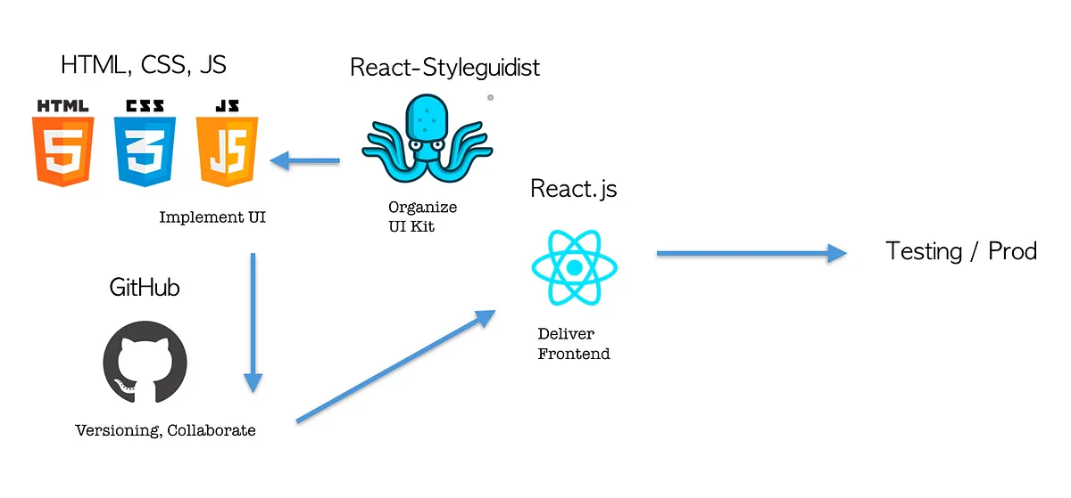
UI Engineering flow
At the same time, somewhere nearby but in parallel, there is a design system that contains all the same reusable UI patterns as the UI kit.
Based on the design system, engineers develop, implement, and test a library of visual components. A design system is a product and the result of the work of a team of graphic designers and UX specialists.
In fact, when developing a visual language (a.k.a. design system), designers face the same problems as engineers — versioning, co-editing, storing and delivering mockups, updating. They have their own set of tools for all this stuff.
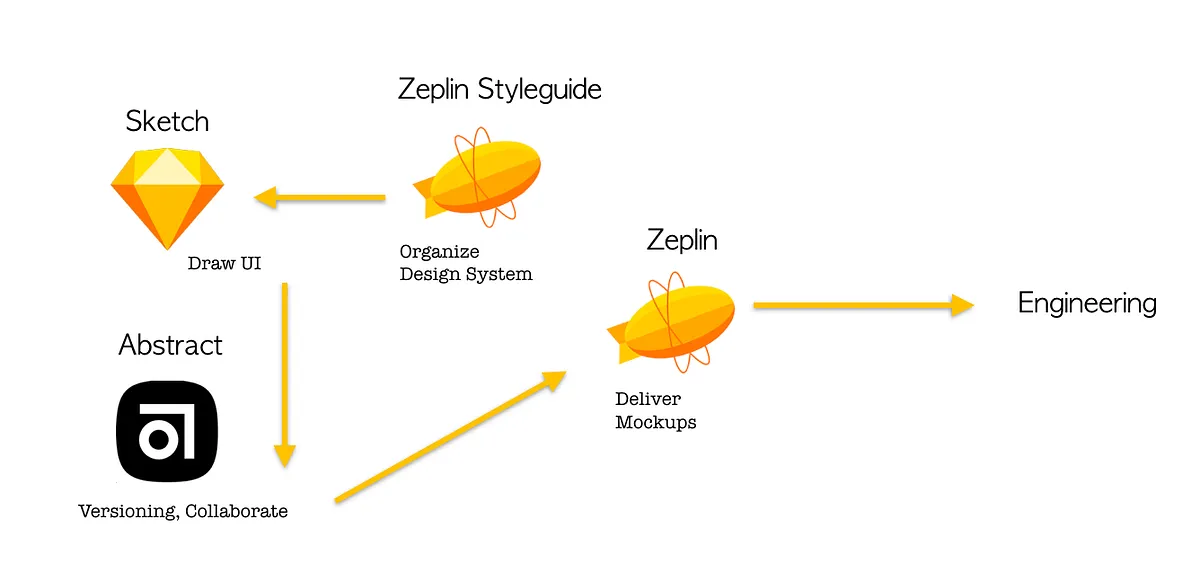
UI Drawing flow
To connect the production cycle of design mockups and components with the results of engineering is something akin to DevOps practices, where the processes of continuous integration, delivery, monitoring, and development of a software product are organically linked.
This phenomenon could be called DesignOps.
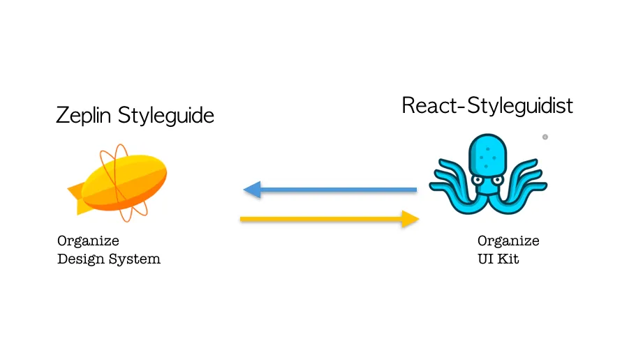
Connecting UI Kit to Design System
I will show such an example of integration with React Styleguidist, with the help of which I described the UI kit in a previous article, and Zeplin — a tool through which designers deliver layouts, describe their pattern library (Zeplin styleguide — components), color palette, typography (text style catalog) and indentation system (spacing).
The integration of these two tools is possible thanks to the Zeplin CLI and the many plug-ins that the community is developing. Styleguidist is not the only tool that can be associated with Zeplin, the corresponding plugin supports the same Storybook.
The first step towards integration is to generate an access token for the Zeplin CLI. This can be done on the CONNECTED APPS tab of your Zeplin profile.
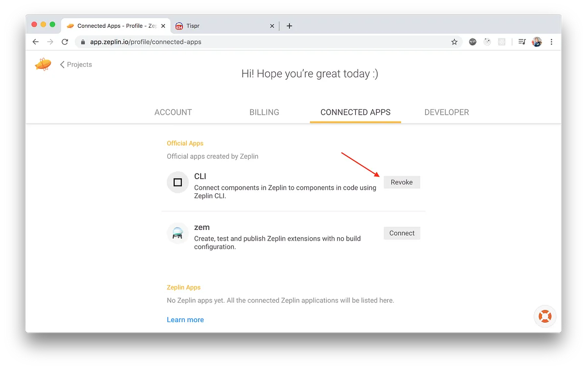
After we set the environment variable, we will need to install several packages from npm — the Zeplin CLI module and the plugin for connecting React components.
$ export ZEPLIN_ACCESS_TOKEN="<your-access-token>"
$ npm install --save-dev @zeplin/cli
$ npm install -g @zeplin/cli-connect-react-plugin
After that, we need to create a configuration file where the connection between the UI kit and Zeplin styleguide components will be registered.
{
  "plugins": [
    {
      "name": "@zeplin/cli-connect-react-plugin"
    }
  ],
  "projects": ["project-id"],
  "styleguides": ["styleguide-id"],
  "components": [
    {
      "path": "/bh-web/packages/web-client/src/tdl/components/checkbox/index.js",
      "zeplinNames": ["checkboxes/checkbox-off"],
      "styleguidist": {
        "name": "checkbox"
      }
    },
    {
      "path": "/bh-web/packages/web-client/src/tdl/components/checkbox/index.js",
      "zeplinNames": ["checkboxes/checkbox-on"],
      "styleguidist": {
        "name": "checkbox"
      }
    }
  ],
  "links": [
    {
      "name": "Styleguidist",
      "type": "styleguidist",
      "url": "https://web-client-staging-t748z32a.tispr.com/styleguide"
    }
  ]
}
You can find the identifier of your project and styleguide in the URL of the web version of Zeplin. You also need to deploy your React Styleguidist somewhere, its URL must be specified in the config. Then just map component names from UI kit to Zeplin styleguide paths.
Now you can try to connect the UI kit to Zeplin.
$ zeplin connect -p @zeplin/cli-connect-react-plugin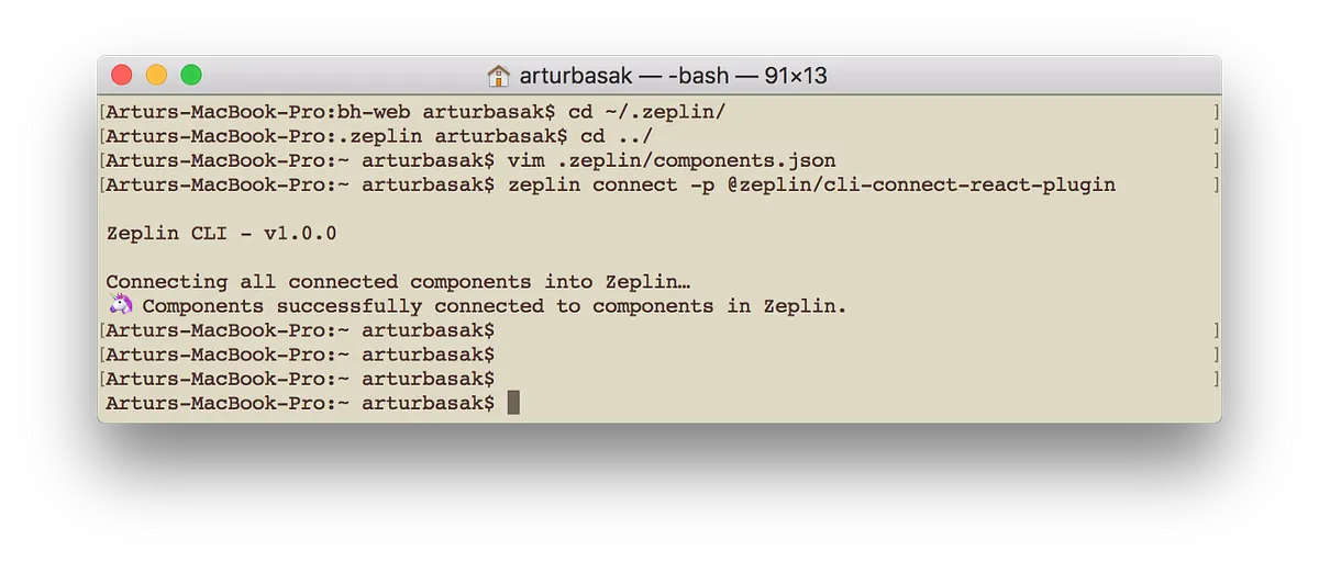
After a successful connection, in Zeplin, the description of each connected component will contain an example of JSX code and the interface of the component, as well as a direct link to the component in the UI dev env.
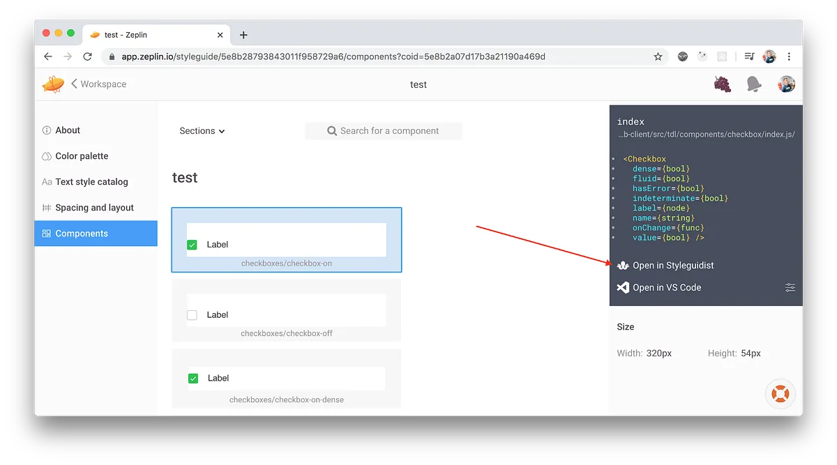
For designers, this means that they can play with a certain component in isolation earlier and give feedback earlier rather than wait until it is fully integrated into the web page.
For engineers, the advantages are obvious. Studying the new mockup, they immediately get a link to which components from the UI kit they can use during development, and which will need to be further developed or created from scratch.
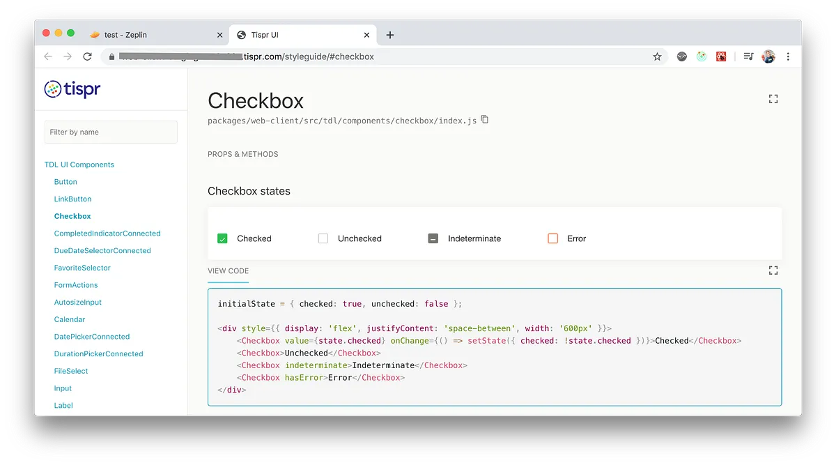
Such binding can be automated and added to the CI/CD processes. The configuration file will be created automatically before the commit and will take into account all the described components of the UI kit.
The path to the components in Zeplin can be written directly in Markdown:
### Checkbox states

#### zeplin_path: checkboxes/checkbox-on

```jsx
initialState = { checked: true, unchecked: false };
<div style={{ display: 'flex', justifyContent: 'space-between', width: '600px' }}>
  <Checkbox value={state.checked} onChange={() => setState({ checked: !state.checked })}>
    Checked
  </Checkbox>
  <Checkbox>Unchecked</Checkbox>
  <Checkbox indeterminate>Indeterminate</Checkbox>
  <Checkbox hasError>Error</Checkbox>
</div>;
```
After which, in a separate step in the pipelines, the zeplin connect command will be called.
const fs = require('fs');
const path = require('path');
const readDocFile = require('./scripts/readDocFile');
const config = require('./configs/zeplin-components.json');

function parseDocFiles(folderPath) {
  let map = {};
  for (const sub of fs.readdirSync(folderPath)) {
    const subPath = `${folderPath}/${sub}`;
    if (fs.lstatSync(subPath).isDirectory()) {
      map = { ...map, ...parseDocFiles(subPath) };
    } else {
      if (sub && sub.endsWith('.doc.md')) {
        const { name, zeplinPath } = readDocFile(subPath);
        if (name && zeplinPath) {
          map[name] = { zeplinPath, path: subPath };
        }
      }
    }
  }

  return map;
}

const componentsMap = parseDocFiles(path.join(__dirname, './src/tdl/components'));

config.components = Object.keys(componentsMap).map((name) => ({
  path: componentsMap[name].path,
  zeplinNames: [componentsMap[name].zeplinPath],
  styleguidist: {
    name,
  },
}));

fs.writeFileSync('.zeplin/components.json', JSON.stringify(config));
Conclusion
Of course, DesignOps is not about integrating two specific tools, it is a broader term, which, I believe, was first introduced in Airbnb. I just showed how you can improve the interaction of the two teams in the example of the integration of two specific tools.
InVision provides a similar bundle, it is called Live Components. Framer X allows you to import the UI kit and build interactive layouts based on it (although the feature is extremely raw).
In general, this is movement in the right direction, and such opportunities will appear more and more …