TL;DR: Wildberries scores 90% on Lighthouse accessibility, yet a blind user cannot finish a purchase. The blockers are an invisible focus ring, keyboard-hostile filters, and status messages that are never announced.
After auditing Priorbank — a Belarusian retail bank whose web app is the primary way its customers move money — I wanted a bigger, noisier target. The holiday season had just wrapped up, which is peak time for online marketplaces: everyone is buying gifts, revenue spikes, and the infrastructure takes a beating.
My personal favorite in that category is Wildberries. For readers outside the region: it is one of the largest e-commerce marketplaces in the CIS, roughly the Amazon-or-Walmart tier of player for that market — hundreds of millions of orders a year, everything from socks to washing machines, and pickup points on practically every street. I use it constantly, which is exactly why I wanted to know how it treats people with disabilities. Being wildly popular and being accessible are unrelated properties.
One caveat before we start. This is not a hit piece. Every product has its own business priorities, and where accessibility is not legally mandated it is a choice each company makes for itself. My own product does not meet every criterion either, and neither did most of the products I have worked on. My analytics from last year showed that 20% of my user base scales up the font size for better readability — but I doubt a single one of them is fully blind and driving the app with a screen reader.
It is also worth naming the uncomfortable incentive around this topic. In some jurisdictions the strongest interest in accessibility comes from law firms rather than from users: they find a company that fails the requirements, recruit plaintiffs with disabilities, and file a multi-million-dollar suit. The plaintiffs may never have used the product at all. Compliance-driven fear is a poor substitute for actually building the thing well.
Still, Wildberries reaches an audience of millions and sells nearly every household good imaginable. It is a giant, and I was simply curious where it stands on accessibility today.
Audit methodology
Same as before: five checks, nothing more. The test task is deliberately simple — search for a big ridiculous Batmobile, drop it in the cart, and place the order. We follow the path from the first click to the final "Order" button using only a keyboard and a screen reader.
Let's get into it.
1. Accessibility statement and skip links
Result: both markers are missing.
There are no skip links anywhere — the shortcut that jumps you past the header straight to the main content. That fails WCAG 2.4.1 Bypass Blocks. Navigation starts right in the header, so a screen reader user has to sit through dozens of links before reaching any products.
There is no accessibility statement either. In fact, just finding the footer is a challenge. I failed on the first attempt: nearly every page uses infinite catalog scrolling, so the footer keeps running away from you. I only managed to see its links from the cart. It turns out there is a dedicated shortcut button at the bottom that opens it — more on that button later.

Takeaway: the first impression is that navigation for assistive technology was never part of the original design, and neither was any public statement about where the platform actually stands.
2. Keyboard navigation
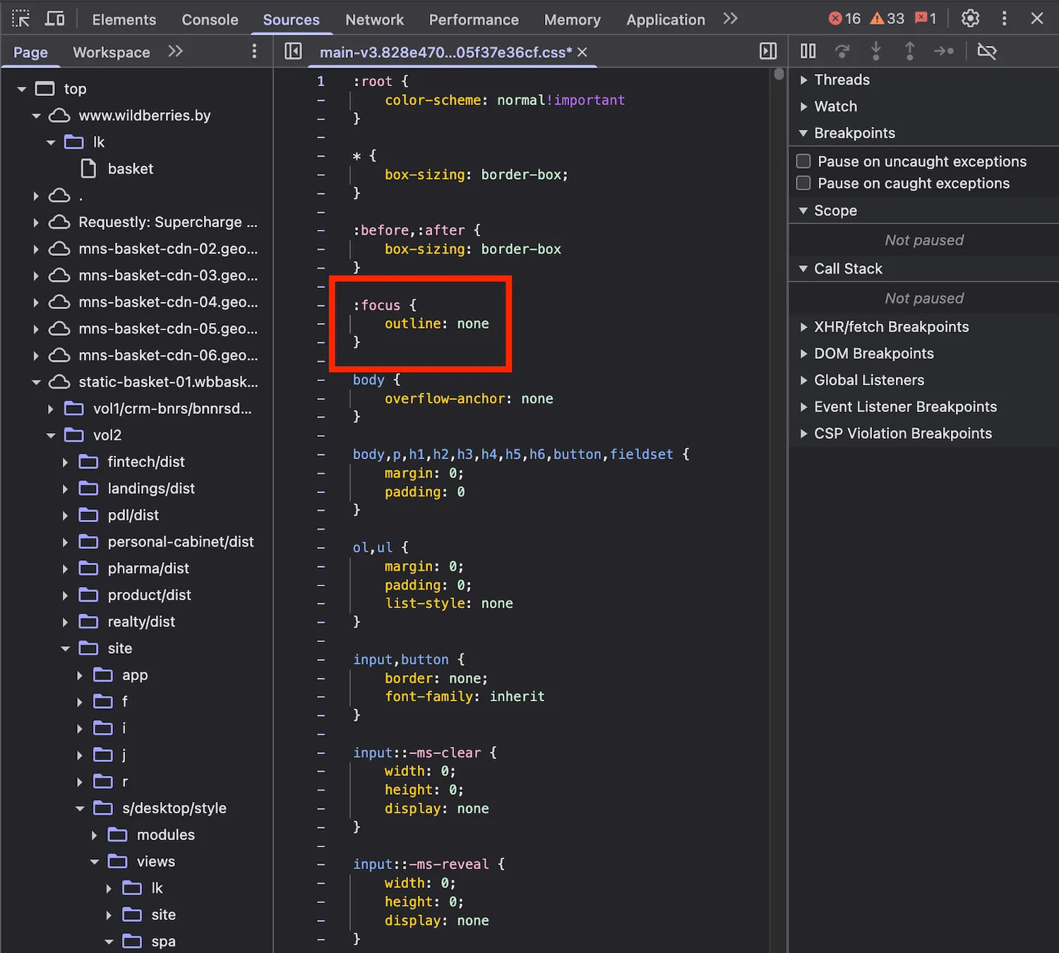
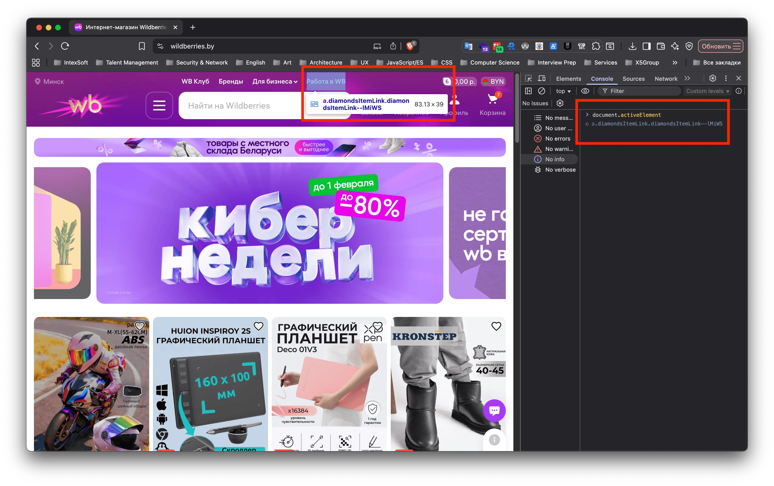
Result: the genre classic, familiar from countless products — :focus { outline: none } applied across the entire application. I have no idea where I am or where I am moving; the focus indicator is simply invisible. That is a direct violation of WCAG 2.4.7 Focus Visible.
The modern approach is :focus-visible, which shows the indicator only during keyboard navigation and stays out of the way for mouse users:
:focus {
  outline: none;
}
:focus-visible {
  outline: 2px solid var(--brand-color);
}
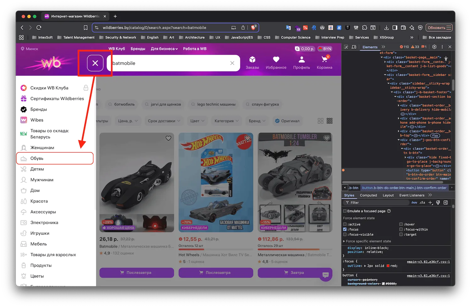
Side menu. A header button labeled aria-label="Site navigation" opens a slide-out menu. Amusing detail: even though the menu is visually hidden until you press that button, the keyboard still walks through every one of its items. They all remain in the tab order while invisible, which is thoroughly disorienting.
Filters — a complete failure. The "All filters" sidebar does open from the keyboard, but focus is never moved into it and never trapped there. The panel slides in while you keep tabbing around underneath the dimmed overlay, hoping you eventually land on a filter. And the "Sort by", "Color", "Category", and "Brand" controls are dropdowns that only appear on mouse hover. Neither Space nor Enter opens them from the keyboard. They are, in practice, entirely unreachable.
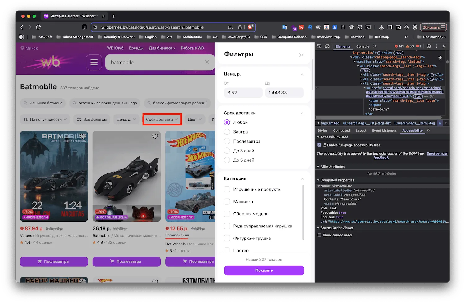
Takeaway: without a mouse, filtering products or using the menu properly is close to impossible. That blocks an entire class of users.
3. Color contrast
Result: at a glance the palette is bright and saturated, but two spots looked suspicious.
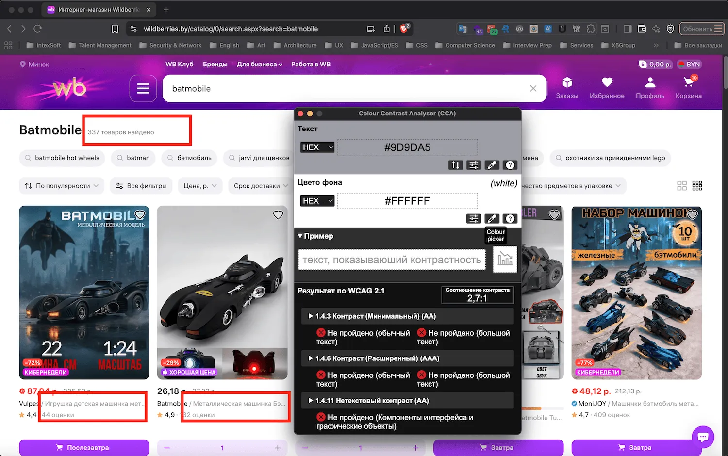
First, white text on a light gray background — the secondary caption on a product card.
Second, and more importantly, lilac on purple in the header for the key menu items: "Orders", "Favorites", "Profile", and "Cart". These are the primary entry points of the whole site.
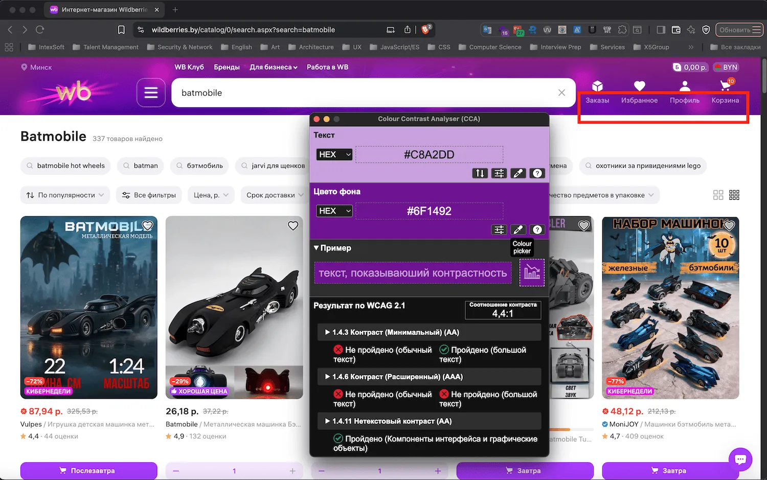
The hunch was right: neither passes WCAG 1.4.3 Contrast (Minimum) at Level AA. The measured ratios are 2.7:1 and 4.4:1 against a 4.5:1 minimum for normal text. For the global navigation of a marketplace this size, that is a serious oversight.
4. Screen reader and keyboard testing
Time to switch into low-vision mode and turn on VoiceOver. I eventually claw my way to a product. This is where it gets interesting, because now I want to hear how the information is actually announced.
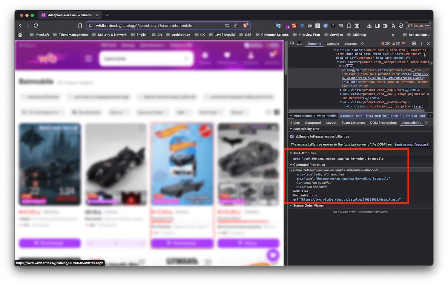
Prices. They are announced, but with no explanation of the discount. What is visually obvious — a current sale price next to a struck-through original — comes through as two unlabeled numbers. There is no way to tell which is which.
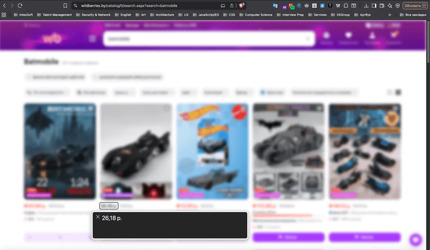
Add-to-cart button. It is called "Day after tomorrow." Wildberries uses the delivery estimate as the button's label, so working out that pressing it adds the item to your cart is a genuine puzzle. That is not a button, it is a riddle.
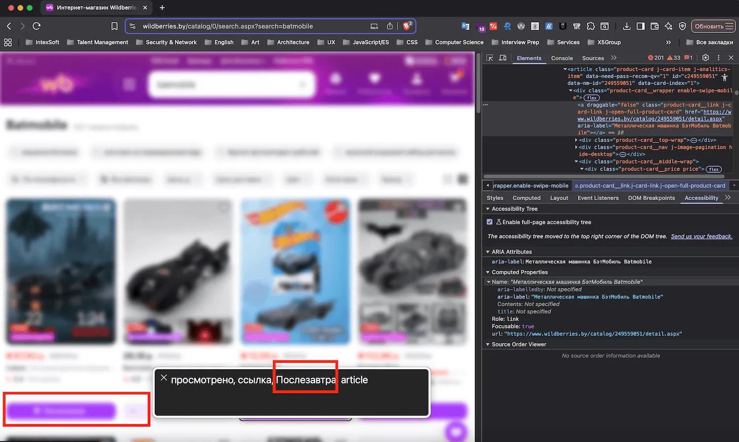
The add confirmation. Say I take the risk and press it. Disappointment: the "added to cart" notification is never announced. Its ARIA markup is wrong, so the result is silence. The card's state does not change for the screen reader either — the "Day after tomorrow" button simply disappears and is replaced by two unlabeled "buttons" with a number between them (a quantity stepper, as it turns out). A user with low vision has no way of knowing any of this happened.
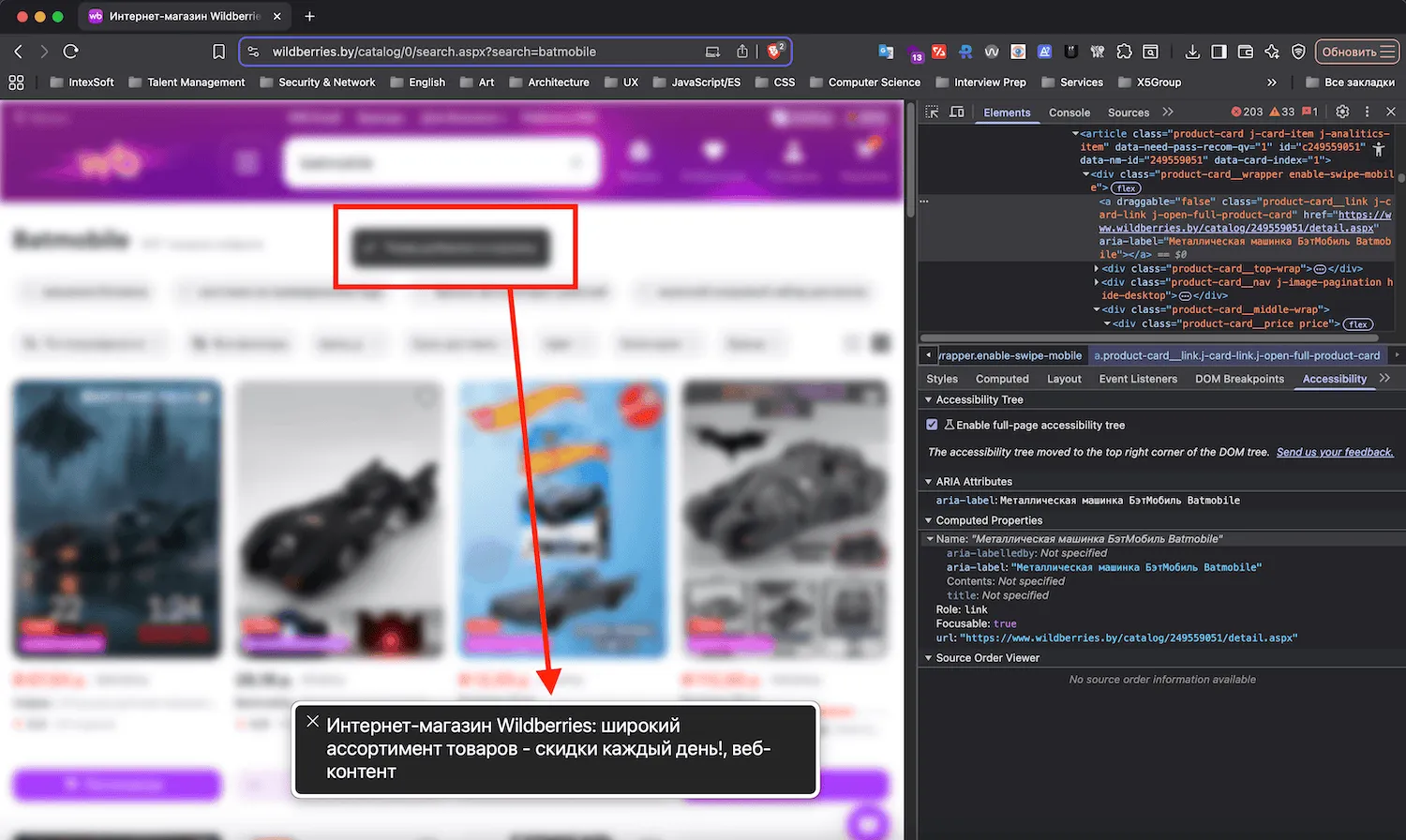
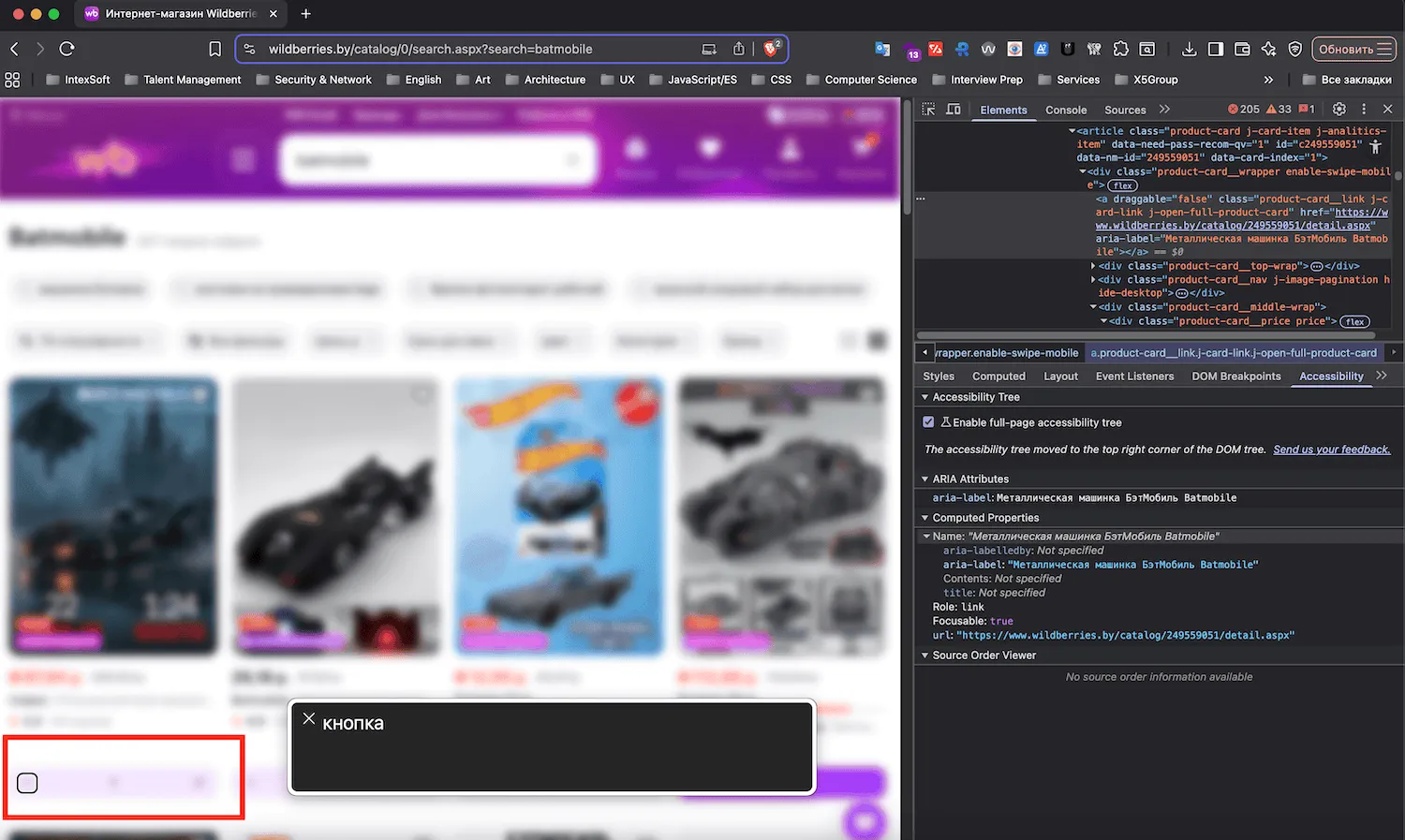
The cart, and the checkout fiasco. There is no quick jump to the cart. You have to travel back up to the header, find the indicator, verify it, and only then navigate. Fine — say I manage that. I select the item, press "Order", and… nothing happens. Just silence.
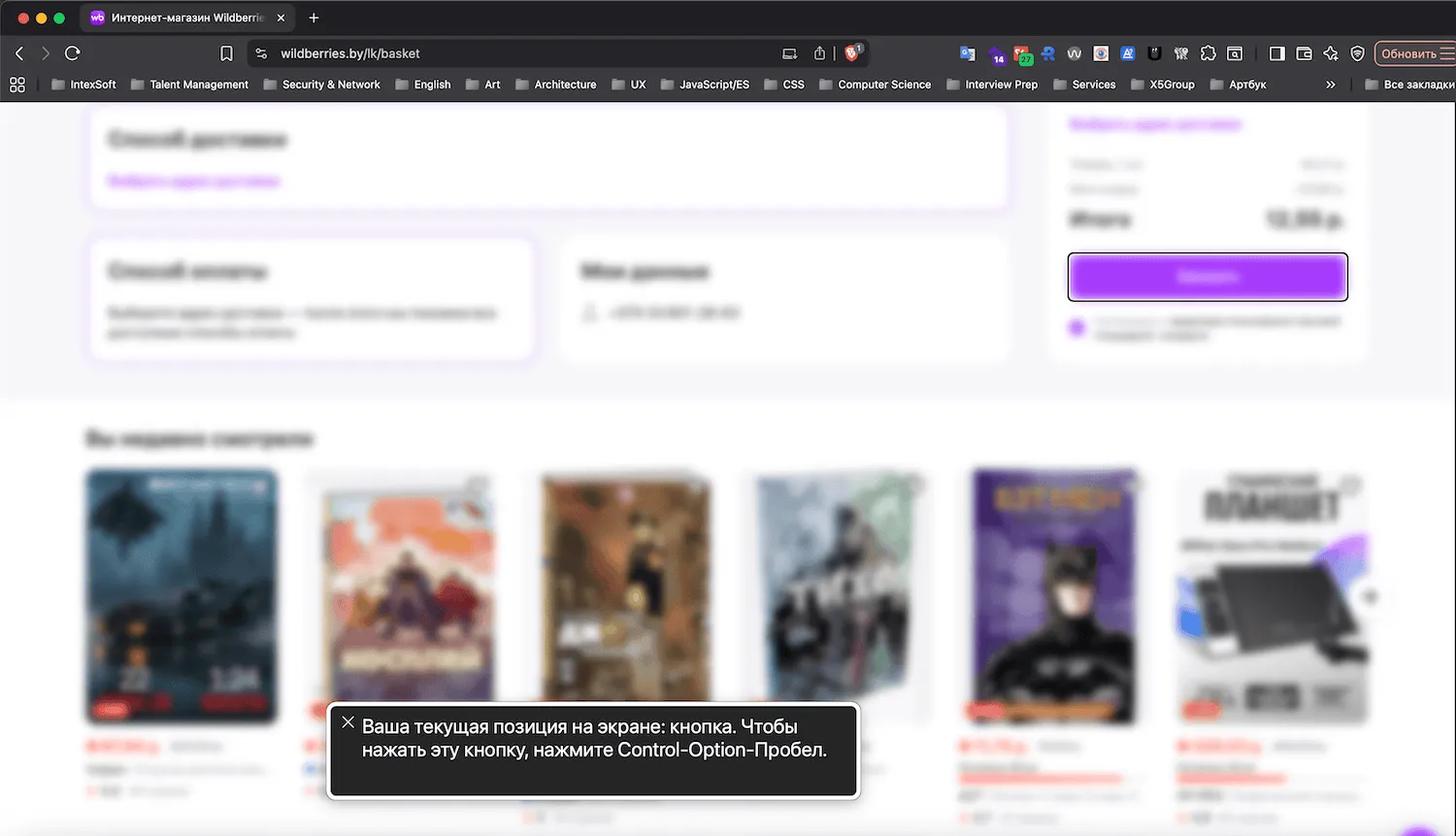
The root cause: the app requires you to pick a delivery address in a separate section, and with keyboard plus screen reader there is no way to learn that. No error message, no focus moved to the field — only a visual hint in the form of a purple outline. So: total failure. I could not place the order after covering 90% of the journey.
5. Automated scanning
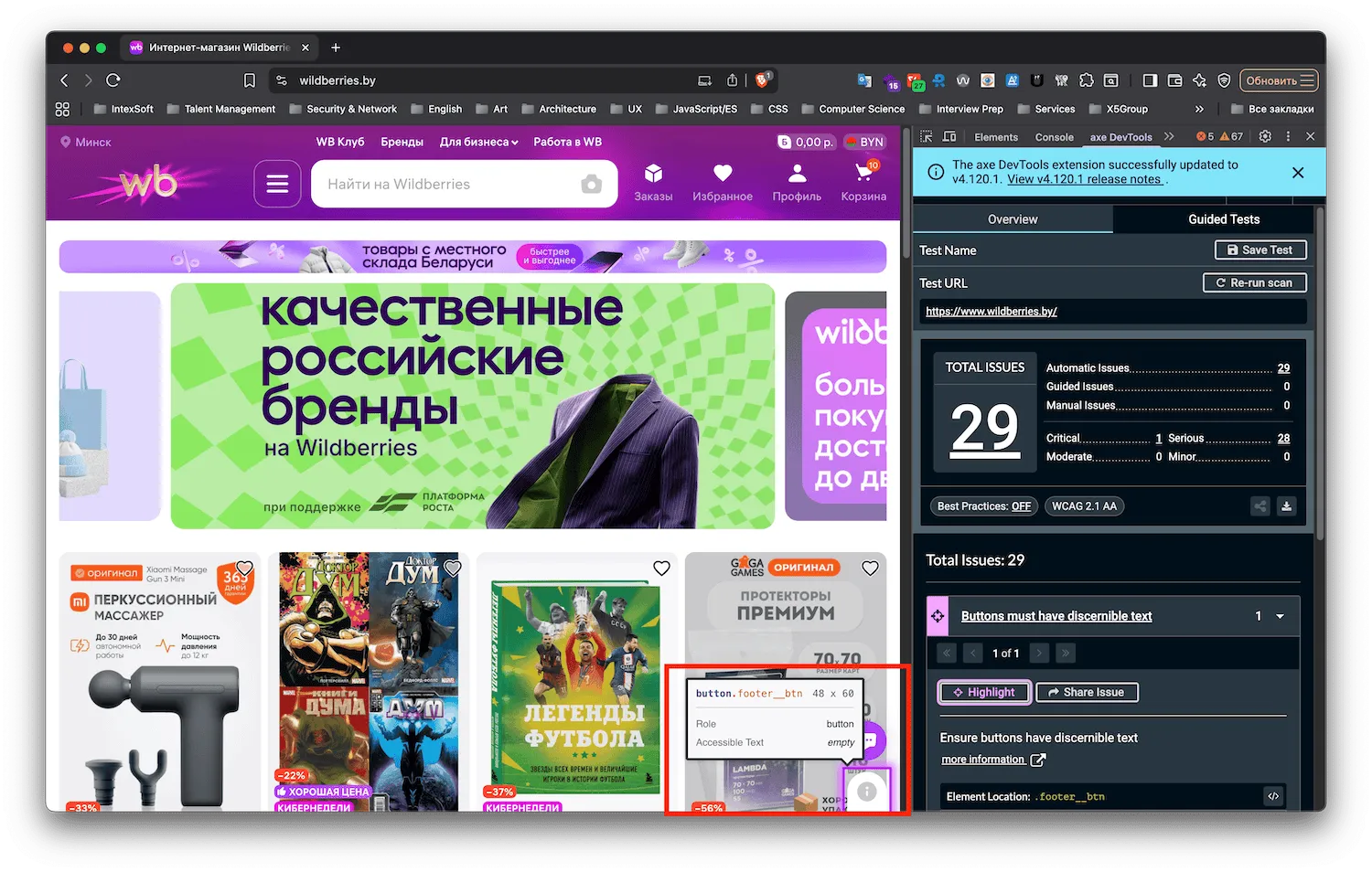
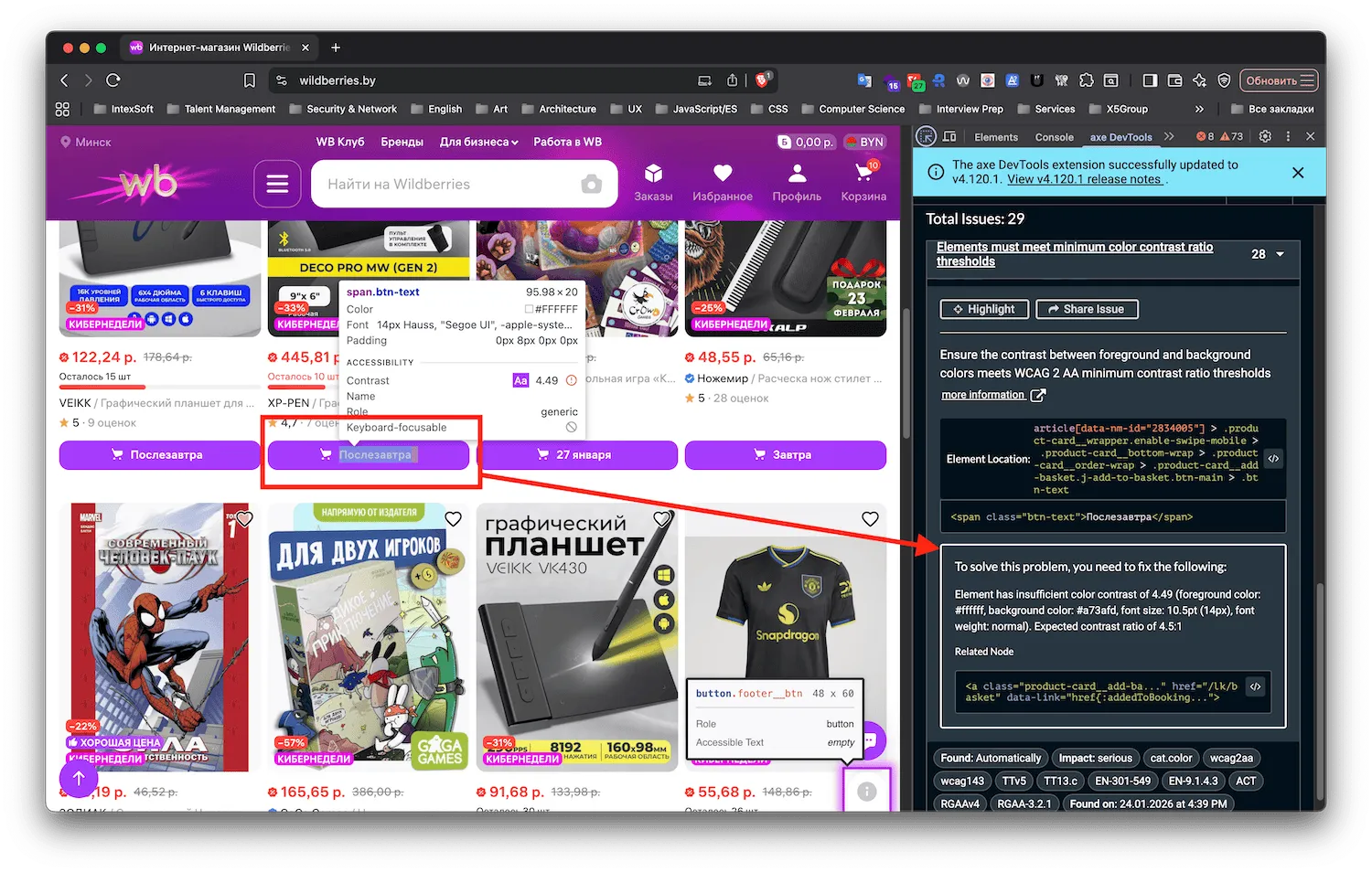
Deque axe: 29 issues. One critical — that magic shortcut button that opens the footer has no accessible name (aria-label). The other 28 are serious, mostly color and contrast. It turns out the add-to-cart buttons, the primary conversion control on the entire site, do not have sufficient contrast. Delightfully, they miss the 4.5:1 threshold by 0.01: the purple-on-white combination lands at 4.49:1. It feels like somebody did check, then rounded in their own favor.
Lighthouse: 90% for accessibility, flagging the same issues axe found. Funny, isn't it? A 90% score, and I still could not place an order. This is a textbook demonstration of why automated tooling covers only about 30% of WCAG criteria — it cannot evaluate interaction logic or whether a user journey completes. Do not lean on tool metrics alone; sometimes they are not even half a measure.
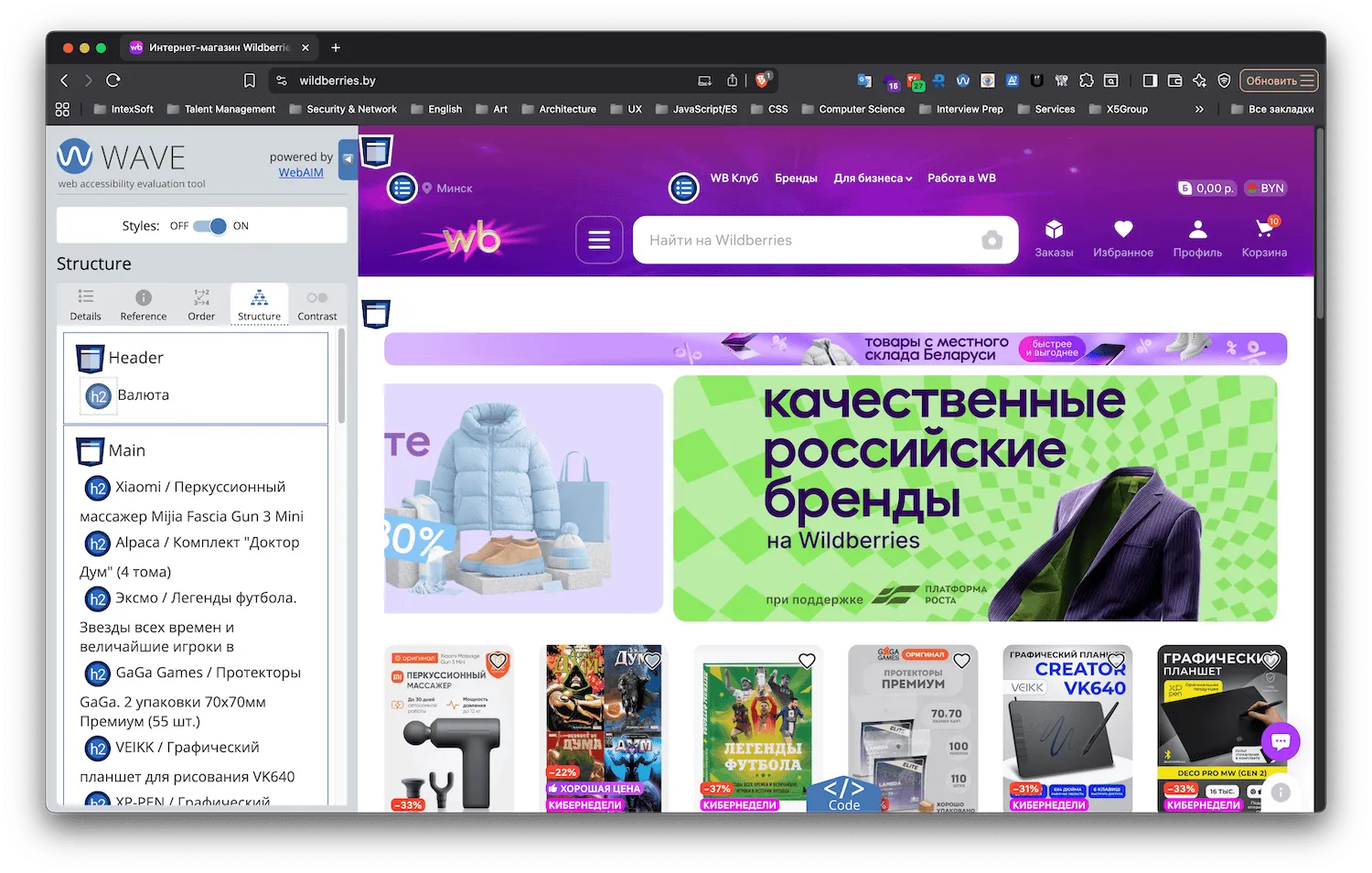
WAVE: the interesting find here is the heading structure. There is no h1 at all, only h2 elements. There is no hierarchy to speak of, and the first heading on the page is… "Currency." What that tells you is that the semantic structure of the page was never built.
Recommendations
If the Wildberries team wanted to improve accessibility, here is the prioritized list.
Critical (blocks usage):
- Add a visible focus indicator via
:focus-visible. - Fix focus trapping in modals and drawers (filters, menu).
- Make filters keyboard-operable (open on Enter/Space).
- Announce notifications with
aria-live="polite", possibly"assertive"for the cart. - Fix checkout validation so errors are actually reported to the screen reader.
High:
- Add a skip link to the main content.
- Fix contrast in the header menu and on add-to-cart buttons.
- Rename "Day after tomorrow" to something like "Add to cart (delivery: day after tomorrow)".
- Add price semantics: "Sale price: X", "Original price: Y".
Medium:
- Build a real heading hierarchy, starting with an
h1. - Remove the closed side menu from the tab order (
inertortabindex="-1"). - Publish an accessibility statement in the footer.
Verdict: accessibility as a luxury, not a requirement
Wildberries is powerful, convenient, and enormously popular. On accessibility, though, it looks like a typical high-load product where nobody approached the topic systematically.
What is there: minimal baseline use of some ARIA attributes (frequently incorrect), 90% of automated checks passing, and decent alt text on images.
What is not: considered keyboard navigation, semantic markup, accessible interaction patterns, adequate contrast on key elements, and — most importantly — any way to complete the core journey without sight.
This is not malice, it is prioritization. Until accessibility becomes a KPI on par with conversion rate or page load time, little will change. Which is a shame, because an audience of millions includes plenty of people who cannot simply reach over and click a mouse. For them, this superstore stays a beautiful shop window with the door locked.
P.S.
The Batmobile was never ordered. I hope Batman has other supply channels.