Why do so many teams keep accessibility at arm's length?
Mostly because it looks like homework. Before you can do anything useful, you apparently have to absorb a whole shelf of documents — WCAG, Section 508, ADA, EAA, ARIA, ATAG, UAAG. And the list never stops growing: countries, states, and regions keep adding their own acts and directives on top.
You do not need any of that to get started. In the spirit of WAI's Easy Checks, I run a deliberately down-to-earth pass that anyone on the team can pick up — engineer, designer, QA, or product manager.
The idea behind it
Accessibility is not a checklist sport. It is about people: those living with a permanent disability and those who are temporarily or situationally constrained.
- Someone who is blind.
- Someone with a broken arm for the next six weeks.
- A parent holding a child in one arm.
- Someone squinting at their phone in bright sunlight.
- Someone with a color vision deficiency.
If a person cannot use your product, that is a product failure. Bad UX, an audience you never served, a standard you never met — pick your framing. WHO statistics and the legal deep dive can wait for a longer piece.
The five-step quick audit
1. Culture markers
These are a fast read on how much a team actually cares. When they are present, the rest of the site is usually in reasonable shape too.
An accessibility statement
Start by looking for an accessibility statement. The link normally sits in the footer, next to the privacy policy and terms of service.
Its presence is a good sign. It means the team is publicly on the record about the work, has written down its commitments, and has opened a channel for feedback. A decent statement usually tells you:
- how testing is done — manually, automatically, with disabled participants;
- which standards and tools are in play (WCAG, screen readers, and so on);
- which barriers are known and still unresolved;
- where to report the trouble you hit.
For a development team, publishing a basic version of that page is close to free, and it buys transparency and trust immediately.
An example of an accessibility statement:
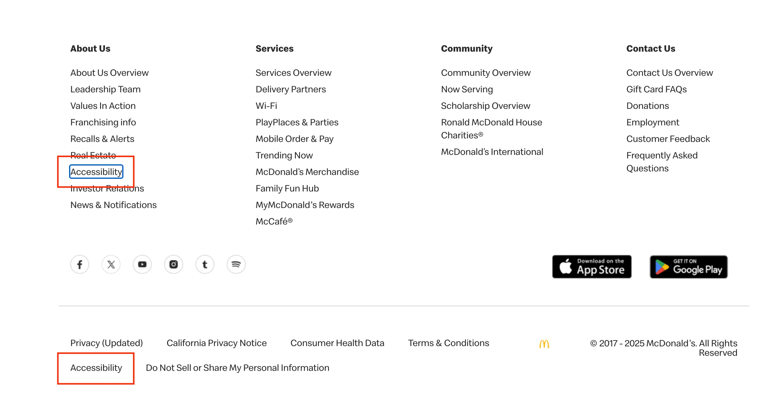
Great accessibility comes from the implementation underneath, not from a nicely worded policy page. A site can be perfectly accessible with no such document at all.
Even so, a statement is far more than a box to tick. It does real work on several fronts:
- It signals priorities. For users, it is visible proof that inclusion is on the team's radar, and that alone builds trust.
- It creates transparency. You can say plainly what has been tested and works, and where barriers remain.
- It opens a dialogue. This is the important one. A clear way to reach the team turns a monologue into a conversation, and the reports you get back make the product better.
So the statement is less about "required by the rules" and more about "sensible if you want an honest relationship with all of your users."
Skip links
Check whether skip links are implemented. Press Tab as soon as the page loads: the first focusable control in the header should read something like "Skip to main content" or "Skip navigation."
This simple, well-established pattern lets keyboard and screen reader users jump straight to the content, past the repeating navigation blocks.
An example of skip links:

2. Color and contrast
Color problems are among the most common failures out there.
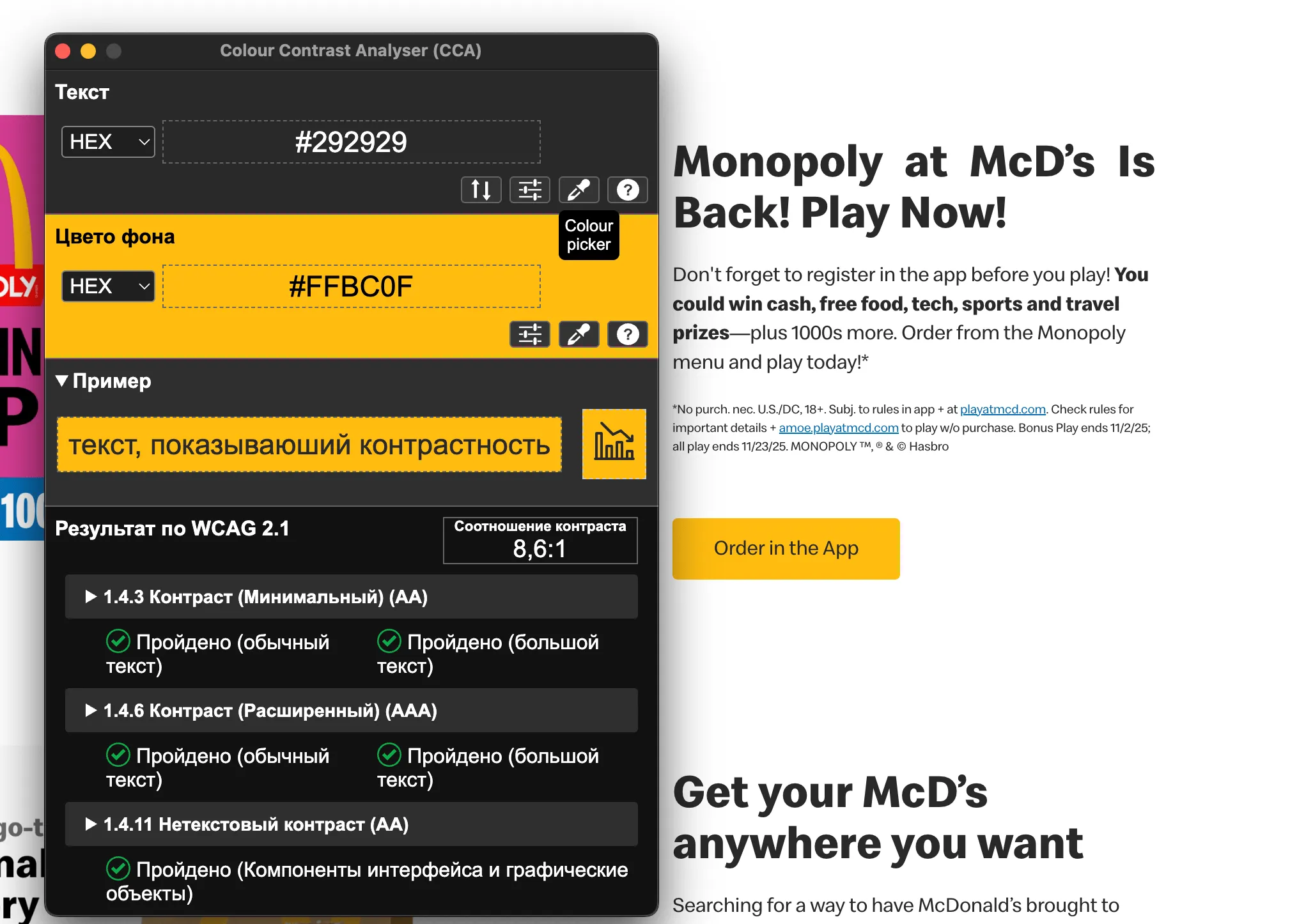
- Check any suspicious pairing with Colour Contrast Analyser (CCA). I use TPGi's desktop app because it lets me move between tabs and windows without being tied to the browser, but a browser extension or an online tool such as WebAIM's checker works just as well. This matters for people with low vision or a color vision deficiency, and for anyone outdoors in bright sun.
- Make sure color is never the only carrier of information. Back the signal up with text or another non-color cue.
Checking contrast on the site:
3. Keyboard navigation
If the site is not usable from the keyboard, it is unusable for a lot of people.
- Can you reach every interactive element with Tab and Shift+Tab?
- Is focus visible? Did someone drop
outlinewithout providing a replacement? Is the indicator obvious and high-contrast enough? - Is the order sensible? Focus should move in a logical sequence that matches the visual flow of the page — top to bottom, left to right in LTR layouts.
4. Simulate the constraints
This is the most powerful step. It shows instantly how much of the interface depends on perfect eyesight, and it turns abstract barriers into something you feel.
- Blur the page heavily to approximate low vision. I built myself a small browser extension for this, but the console does the job just as well:
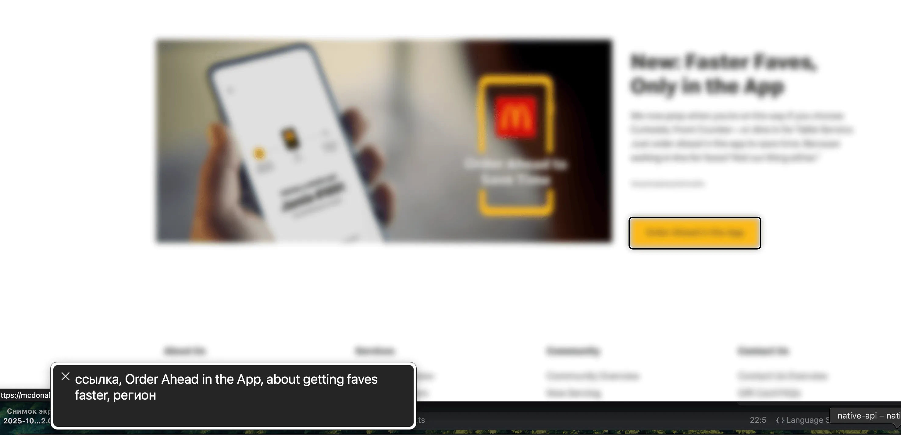
document.body.style.filter = 'blur(5px)';- Turn on a screen reader and try to complete a basic task with speech and the keyboard only. I use VoiceOver; depending on your OS, NVDA, JAWS, Narrator, or Orca will do.
Checking the site with VoiceOver:
5. Automated scanning
Tools will not find everything, but they are very good at catching technical defects. The commonly cited figure is that automation surfaces somewhere around a third of the issues in a product.
I run the following combination:
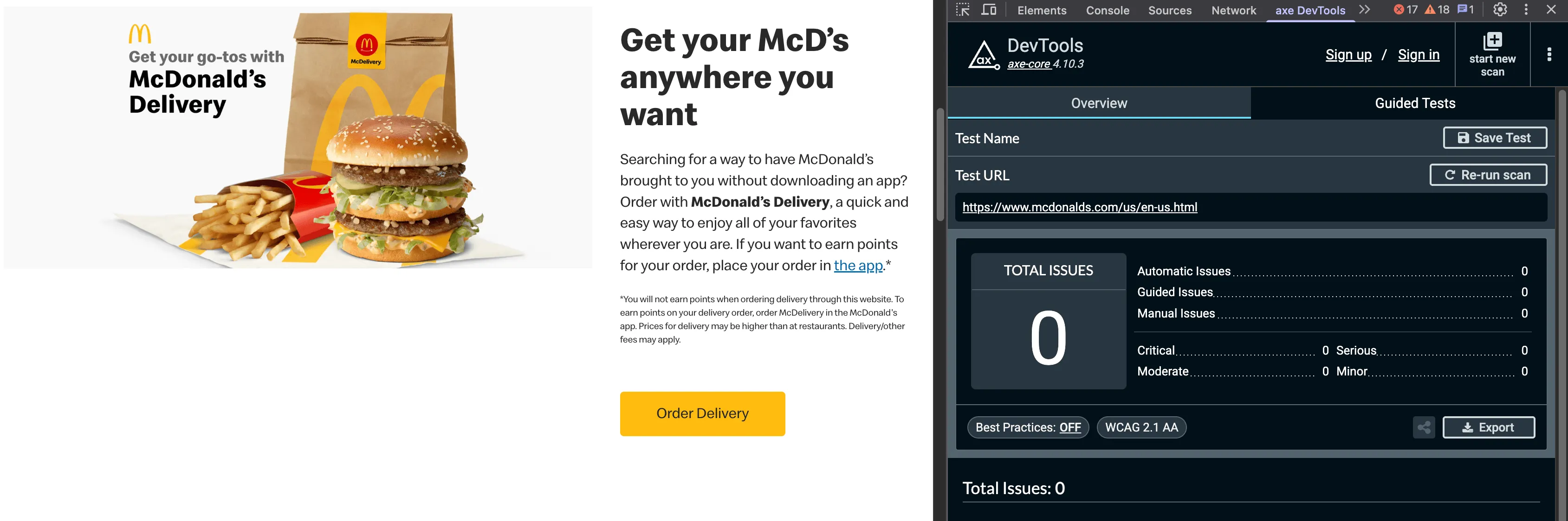
- axe DevTools — probably the best scanner on the market for this kind of work right now;
- WAVE — my go-to for seeing page structure and how information is exposed;
- Lighthouse and ARC Toolkit as a second pass after axe.
Checking the site with axe DevTools:
Checking the site with WAVE:
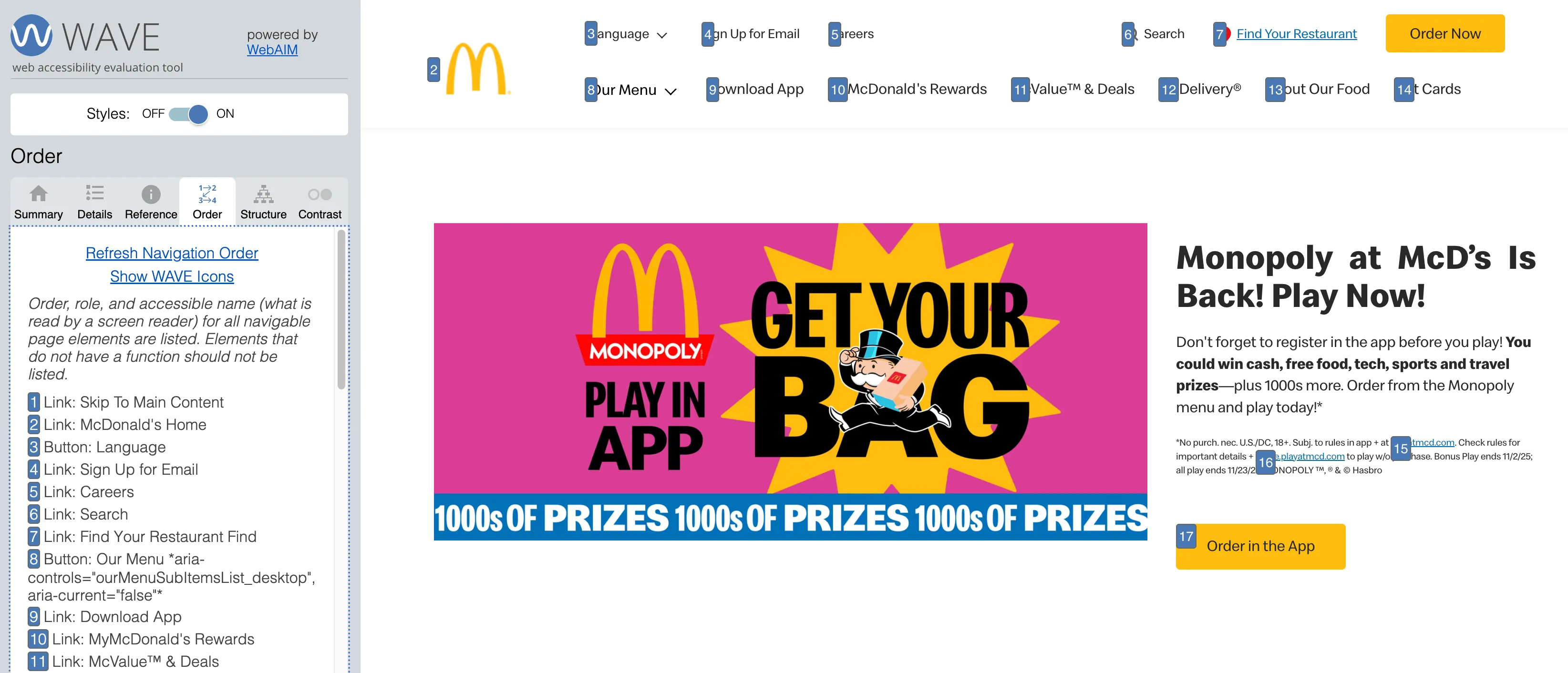
They catch the technical stuff: missing alt text, malformed HTML, ARIA mistakes, WCAG violations. You do not need to know the specs by heart — the findings tell you what to fix.
Red flag: magic overlays
Let me be blunt: I see no point in auditing a web app that ships an accessibility overlay or widget. For me that is an immediate fail. Products like accessiBe, UserWay, and their peers are not a solution — they are a symptom.
Why they are a problem:
- they treat the symptoms instead of the disease;
- they manufacture an illusion of accessibility;
- they cope badly with dynamic content;
- they frequently break native accessibility that already worked;
- the disability community has largely come out against them.
An overlay means a high probability of fundamental accessibility debt in the code underneath. The goal of those products is rarely user comfort; it is lowering the odds of a multi-million-dollar lawsuit.
What you walk away with
Fifteen to thirty minutes of this gets you:
- a clear picture of where accessibility stands;
- a list of the barriers that actually block users;
- a sense of where to go next.
You do not need a certification to start making products more accessible. Put yourself in the user's position and run these five checks.
This approach targets substance rather than formal compliance. That said, after these five steps I am fairly confident you will land close to WCAG Level AA anyway. Accessibility is about people, not checkboxes.